Hey everyone! Our latest project is something a bit different - a 20 second animation. We had to comment on something affecting the environment and make a 20 second animation that would appear on something like MTV or VH1. I chose to comment on consumerism - this i what I came up with:
Saturday, 15 October 2011
Monday, 12 September 2011
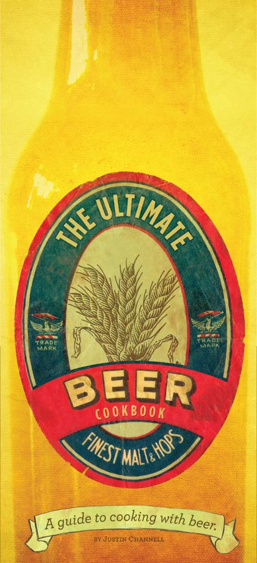
The Ultimate Beer Cookbook
For this project we had to come up with a concept and theme for a cookbook, create a cover, index, and two example recipes. I based my book on cooking with beer - here are my final results :


Tuesday, 23 August 2011
Happiness is Only a Choice Away
Hi everyone - I've been busy with another project. We had to take a given article an create a double page magazine spread with a run-on page. We had to incorporate an illustration into the overall design.
The article that I chose was based on making a conscious choice to be happy, and achieving true happiness. This is what I came up with:


The article that I chose was based on making a conscious choice to be happy, and achieving true happiness. This is what I came up with:
Tuesday, 26 July 2011
Packaging Project : 5 Doughnuts & Vitamins
I've been really busy with our latest packaging project which includes two parts:
5 Doughnuts to Delight the Senses
The idea for my doughnut packaging was inspired by the stereotypical representation of the classic 1950’s housewife.

I incorporated the theme of the 5 senses by illustrating the woman going through the process of making the doughnuts. These steps are illustrated on a set of 5 boxes, each depicting a different stage of the process and linking that stage to a sensation.


Lyfia Vitamins for Seniors

The name ‘Lyfia’ originates from the name of a mythical mountain of the same name. The Nordic Goddess of healing,‘Eir’, is said to have lived on Mt. Lyfia where she worked on healing mind, body and spirit. Eir’s avatar form is said to be a copperhead snake.
The Lyfia logo is based on an image of a mountain and the triangular beige pattern on the copperhead snake.

Preferred to pill bottles and standard blister cards, the large, fold-out panels guarantees that the dosing instructions, reminders and branding of the outer carton stay with the inner card for the life of the course. This boosts patient compliance, builds strong brand identification and patient loyalty, and allows for large, readable fonts.


- Doughnut box design for 5 doughnuts - based on the 5 senses.
- Vitamins for seniors suffering from arthritis
5 Doughnuts to Delight the Senses
The idea for my doughnut packaging was inspired by the stereotypical representation of the classic 1950’s housewife.
I incorporated the theme of the 5 senses by illustrating the woman going through the process of making the doughnuts. These steps are illustrated on a set of 5 boxes, each depicting a different stage of the process and linking that stage to a sensation.
Lyfia Vitamins for Seniors
The name ‘Lyfia’ originates from the name of a mythical mountain of the same name. The Nordic Goddess of healing,‘Eir’, is said to have lived on Mt. Lyfia where she worked on healing mind, body and spirit. Eir’s avatar form is said to be a copperhead snake.
The Lyfia logo is based on an image of a mountain and the triangular beige pattern on the copperhead snake.
Preferred to pill bottles and standard blister cards, the large, fold-out panels guarantees that the dosing instructions, reminders and branding of the outer carton stay with the inner card for the life of the course. This boosts patient compliance, builds strong brand identification and patient loyalty, and allows for large, readable fonts.
Wednesday, 1 June 2011
Fallen Leaves : Photography
So, I've just recently completed my first ever proper photography project. Our brief stated that we must choose a lyric and communicate it through a photograph. This may sound easy, but communicating words into a meaningful image in an interesting manner is a difficult task.
I eventually landed up on a song by Billy Talent called Fallen Leaves.The song was written in memory of one of their close friends who got hooked on heroin and passed away. The song is based around a town in Vancouver that is notorious for it’s drug problems and is were their friend got hooked on drugs.
This is my end result :
 I made quite a few adjustment, adding in drawn elements and adjusting lighting.


I eventually landed up on a song by Billy Talent called Fallen Leaves.The song was written in memory of one of their close friends who got hooked on heroin and passed away. The song is based around a town in Vancouver that is notorious for it’s drug problems and is were their friend got hooked on drugs.
This is my end result :
I made quite a few adjustment, adding in drawn elements and adjusting lighting.Thursday, 24 March 2011
Hoodie Update
Heya! Megan and I have been super busy working to complete our Hang Ten Hoodie. Here's a few pictures to show you some progress and how our hoodie turned out:


Thursday, 17 March 2011
Afrika Typografika 3
Our class is currently working on something for Garth Walker's (Mister Walker Design) Afrika Typografika #3. We have to develop an African inspired font and create a single page spread to go into the magazine. After scrapping a few different concepts, I decided to get away from the cultural side of Africa and focus on the industrial side of Durban - it's port. I was under the impression that we had to communicate our concept in a formal typeface, but after speaking to Mr. Walker I quickly realised that he was looking for a more photographic approach. After a few trips around container depots and the harbor (which I couldn't get into) I was able to snap some shots that I could use for my typeface. Here's a couple examples of how I used the photos to create the typeface :


I can't display my final spread yet as it might get published and I don't have the distribution rights, but I'll update this post with the final spread as soon as I'm allowed to!
I can't display my final spread yet as it might get published and I don't have the distribution rights, but I'll update this post with the final spread as soon as I'm allowed to!
Subscribe to:
Comments (Atom)